Bootstrap Helper Classes
In this tutorial you will learn about the Bootstrap helper classes.
Bootstrap Helper Classes
Bootstrap provides a handful of CSS classes for common usages.
Contextual Colors
You can use the contextual color classes like .text-success, .text-info, .text-warning etc. to emphasize the text. See the tutorial on Bootstrap typography for more detail.
Contextual Backgrounds
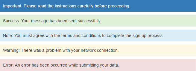
Similar to the contextual text color classes, you can use the contextual background color classes to set the background-color of an element to apply extra emphasis on them.
<p class="bg-primary">Important: Please read the instructions carefully before proceeding.</p>
<p class="bg-success">Success: Your message has been sent successfully.</p>
<p class="bg-info">Note: You must agree with the terms and conditions to complete the sign up process.</p>
<p class="bg-warning">Warning: There was a problem with your network connection.</p>
<p class="bg-danger">Error: An error has been occurred while submitting your data.</p>
— 上面示例的输出将如下所示:
Note: The contextual background classes only apply the CSS background-color property on the element. To adjust the space between content and border-box you have to set the CSS padding property yourself.
Close Icon
Bootstrap provides a generic close icon that can be used for dismissing modals and alerts.
<div class="alert alert-warning">
<a href="#" class="close" data-dismiss="alert">×</a>
<strong>Warning!</strong> There was a problem with your network connection.
</div>
— 上面示例的输出将如下所示:
Caret Icon
Bootstrap provides a generic caret icon to indicate the dropdown functionality. The direction of the caret icon will reverse automatically in dropup menus.
<ul class="nav nav-pills">
<li class="active"><a href="#">Home</a></li>
<li><a href="#">About</a></li>
<li class="dropdown">
<a href="#" data-toggle="dropdown" class="dropdown-toggle">Services <span class="caret"></span></a>
<ul class="dropdown-menu">
<li><a href="#">Design</a></li>
<li><a href="#">Development</a></li>
</ul></li></ul>
— 上面示例的输出将如下所示:
Center Alignment of Content Blocks
You can use the Bootstrap class .center-block to align the content block horizontally center. However, to see the effect of this class you have to set the width of the content block yourself and it should be less than the containing parent element.
<div class="wrapper">
<div class="center-block">Center Aligned DIV Box</div>
</div>
See the tutorial on CSS alignment to learn more about aligning the elements.
Quick Floats
You can quickly float an element to the left or right using the .pull-left and .pull-right classes. These classes included the CSS !important declaration to avoid specificity issues.
<div class="pull-left">Floated to left.</div>
<div class="pull-right">Floated to right.</div>
Clearfix
The .clearfix class clears the float on any element. This class is widely used for fixing the collapsing parent issue, where parent element contains floated boxes.
<div class="wrapper clearfix">
<div class="pull-left">Float to left</div>
<div class="pull-right">Float to right</div>
</div>
See the tutorial on CSS alignment to learn more about clearing floats on an element.
Showing and Hiding Content
You can force an element to be shown or hidden on all the devices using the .show and .hidden classes. These classes also included the CSS !important declaration to avoid specificity conflicts, just like the quick floats.
Furthermore, you can use the class .invisible to toggle only the visibility of an element; however the element still occupies the space in the layout.
<div class="show">This is visible to the user.</div>
<div class="hidden">This is not visible to the user.</div>
<div class="invisible">This is not visible but affects the layout.</div>
Content Specific to Screen Readers
The special .sr-only class hides an element to all devices except screen readers.
<p>This paragraph is visible to all devices.</p>
<p class="sr-only">This paragraph is only visible to screen readers.</p>
Hide Text Only
You can use the class .text-hide to hide the text content of an element.
<h1 class="text-hide">The text of this heading is not visible</h1>
<p class="text-hide">The text of this paragraph is not visible.</p>
Warning: Think twice before using this class, because it uses the styles color: transparent and font-size: 0px to hide the text. Search engines consider such techniques as spam that may result in penalty.


