Bootstrap Fixed Layout
In this tutorial you will learn how to create fixed layouts with Bootstrap.
Creating Fixed Layout with Bootstrap
With Bootstrap 3 you can still create layouts of web pages based on fixed number of pixels, however this time it is responsive from the start as opposed to previous 2.x version where you need to include the responsive style sheet to make it responsive for other devices.
The process of creating the fixed yet responsive layout starts with the .container class. After that create rows with the .row class to wrap the horizontal groups of columns. Rows must be placed within a .container for proper alignment and padding.
Further columns can be created inside the rows using the predefined grid classes like .col-xs-*, .col-sm-*, .col-md-* and .col-lg-* where * represent grid number and should be from 1 to 12. Learn more about the Bootstrap grid system.
Note: Actual content like text, images, videos, etc. should be placed within columns, and only columns may be the immediate children of rows.
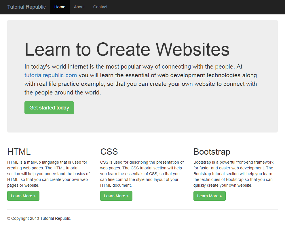
The following code creates a fixed width responsive layout that is 750px pixels wide on small devices like tablet having screen width ≥768px, whereas 970px wide on medium devices like desktop and laptop having screen width ≥992px and 1170px wide on large devices like large desktops having screen width ≥1200px. However the layout width will be automatically calculated for devices that has screen width <768px like cell phones.
<html lang="en">
<head><meta charset="utf-8">
<meta http-equiv="X-UA-Compatible" content="IE=edge">
<meta name="viewport" content="width=device-width, initial-scale=1">
<title>Bootstrap 3 Fixed Layout Example</title>
<link rel="stylesheet" type="text/css" href="css/bootstrap.min.css">
<script src="https://code.jquery.com/jquery-1.12.4.min.js"></script>
<script src="js/bootstrap.min.js"></script>
</head><body><nav id="myNavbar" class="navbar navbar-default navbar-inverse navbar-fixed-top" role="navigation">
<!-- Brand and toggle get grouped for better mobile display --><div class="container">
<div class="navbar-header">
<button type="button" class="navbar-toggle" data-toggle="collapse" data-target="#navbarCollapse">
<span class="sr-only">Toggle navigation</span>
<span class="icon-bar"></span>
<span class="icon-bar"></span>
<span class="icon-bar"></span>
</button><a class="navbar-brand" href="#">Tutorial Republic</a>
</div><!-- Collect the nav links, forms, and other content for toggling --><div class="collapse navbar-collapse" id="navbarCollapse">
<ul class="nav navbar-nav">
<li class="active"><a href="http://www.qyoo.cn" target="_blank">Home</a></li>
<li><a href="http://www.qyoo.cn/about-us.asp" target="_blank">About</a></li>
<li><a href="http://www.qyoo.cn/contact-us.asp" target="_blank">Contact</a></li>
</ul></div></div></nav><div class="container">
<div class="jumbotron">
<h1>Learn to Create Websites</h1>
<p>In today's world internet is the most popular way of connecting with the people. At <a href="http://www.qyoo.cn" target="_blank">qyoo.cn</a> you will learn the essential of web development technologies along with real life practice example, so that you can create your own website to connect with the people around the world.</p>
<p><a href="http://www.qyoo.cn" target="_blank" class="btn btn-success btn-lg">Get started today</a></p>
</div><div class="row">
<div class="col-xs-4">
<h2>HTML</h2>
<p>HTML is a markup language that is used for creating web pages. The HTML tutorial section will help you understand the basics of HTML, so that you can create your own web pages or website.</p>
<p><a href="http://www.qyoo.cn/html-tutorial/" target="_blank" class="btn btn-success">Learn More »</a></p>
</div><div class="col-xs-4">
<h2>CSS</h2>
<p>CSS is used for describing the presentation of web pages. The CSS tutorial section will help you learn the essentials of CSS, so that you can fine control the style and layout of your HTML document.</p>
<p><a href="http://www.qyoo.cn/css-tutorial/" target="_blank" class="btn btn-success">Learn More »</a></p>
</div><div class="col-xs-4">
<h2>Bootstrap</h2>
<p>Bootstrap is a powerful front-end framework for faster and easier web development. The Bootstrap tutorial section will help you learn the techniques of Bootstrap so that you can quickly create your own website.</p>
<p><a href="http://www.qyoo.cn/twitter-bootstrap-tutorial/" target="_blank" class="btn btn-success">Learn More »</a></p>
</div></div><hr><div class="row">
<div class="col-xs-12">
<footer><p>© Copyright 2013 Tutorial Republic</p>
</footer></div></div></div></body></html>
— 上面示例的输出将如下所示:


