Bootstrap Panels
In this tutorial you will learn how to create panels with Bootstrap.
Introducing Bootstrap 3 Panels
Sometimes you might require to place your content in box for better presentation. In such situation the Bootstrap panel component can be very useful. In most basic form the panel component applies some border and padding around the content.
Example
Try this code »<div class="panel panel-default">
<div class="panel-body">Look, I'm in a panel!</div>
</div>
— The output of the above example will look something like this:
Panels with Heading
You can also add a heading to your panel with .panel-heading class.
Example
Try this code »<div class="panel panel-default">
<div class="panel-heading">This Page is Disabled</div>
<div class="panel-body">This page is temporarily disabled by the site administrator for some reason.<br> <a href="#">Click here</a> to enable the page.</div>
</div>
— The output of the above example will look something like this:
You can also include heading elements from <h1> to <h6> with a .panel-title class.
Example
Try this code »<div class="panel panel-default">
<div class="panel-heading">
<h1 class="panel-title">Panel Title</h1>
</div><div class="panel-body">Panel content…</div>
</div>
Panels with Footer
Like heading you can also add footer section to your panels using the .panel-footer class. The panel's footer can be used to wrap buttons or secondary text.
Example
Try this code »<div class="panel panel-default">
<div class="panel-body">This page is temporarily disabled by the site administrator for some reason.</div>
<div class="panel-footer clearfix">
<div class="pull-right">
<a href="#" class="btn btn-primary">Learn More</a>
<a href="#" class="btn btn-default">Go Back</a>
</div></div></div>
— The output of the above example will look something like this:
Panels with Contextual States
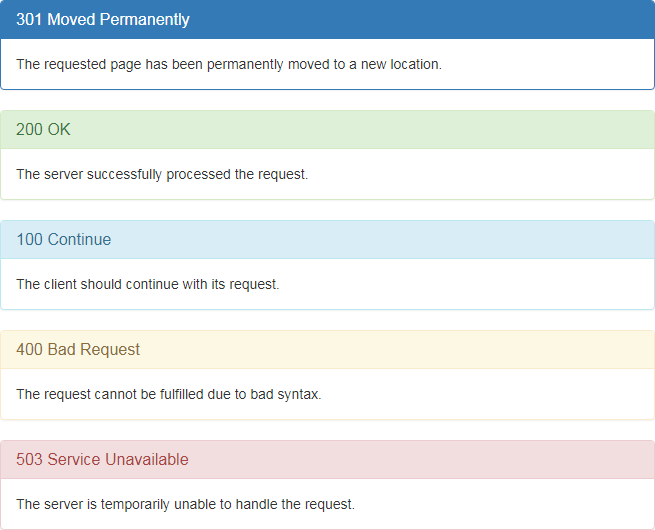
Like other component you also add contextual state classes like .panel-primary, .panel-success, .panel-info, .panel-warning, or .panel-danger on the panel components to make it more meaningful and drawing attention of the user.
<div class="panel panel-primary">
<div class="panel-heading">
<h3 class="panel-title">301 Moved Permanently</h3>
</div><div class="panel-body">The requested page has been permanently moved to a new location.</div>
</div><div class="panel panel-success">
<div class="panel-heading">
<h3 class="panel-title">200 OK</h3>
</div><div class="panel-body">The server successfully processed the request.</div>
</div><div class="panel panel-info">
<div class="panel-heading">
<h3 class="panel-title">100 Continue</h3>
</div><div class="panel-body">The client should continue with its request.</div>
</div><div class="panel panel-warning">
<div class="panel-heading">
<h3 class="panel-title">400 Bad Request</h3>
</div><div class="panel-body">The request cannot be fulfilled due to bad syntax.</div>
</div><div class="panel panel-danger">
<div class="panel-heading">
<h3 class="panel-title">503 Service Unavailable</h3>
</div><div class="panel-body">The server is temporarily unable to handle the request.</div>
</div>
— The output of the above example will look something like this:
Placing Tables and List Groups inside Panels
You can add any non-bordered table within a panel to create more informative tables.
<div class="panel panel-default">
<!-- Default panel contents --><div class="panel-heading">User Information</div>
<div class="panel-body">
<p>The following table contains some personal information about users.</p>
</div><!-- Table --><table class="table">
<thead><tr><th>Row</th>
<th>First Name</th>
<th>Last Name</th>
<th>Email</th>
</tr></thead><tbody><tr><td>1</td>
<td>John</td>
<td>Carter</td>
<td>johncarter@mail.com</td>
</tr><tr><td>2</td>
<td>Peter</td>
<td>Parker</td>
<td>peterparker@mail.com</td>
</tr><tr><td>3</td>
<td>John</td>
<td>Rambo</td>
<td>johnrambo@mail.com</td>
</tr></tbody></table></div>
Similarly you can include full-width list groups within any panel.
<div class="panel panel-default">
<!-- Default panel contents --><div class="panel-heading">Products</div>
<div class="panel-body">
<p>The following products are currently available on our store.</p>
</div><!-- List group --><div class="list-group">
<a href="#" class="list-group-item">Mobile Phones <span class="badge">50</span>
</a><a href="#" class="list-group-item">Laptops & Desktops <span class="badge">145</span>
</a><a href="#" class="list-group-item">Tablets <span class="badge">30</span>
</a><a href="#" class="list-group-item">Audio & Video Players <span class="badge">65</span>
</a><a href="#" class="list-group-item">Camera <span class="badge">8</span>
</a></div></div>


