Bootstrap Alerts
In this tutorial you will learn how to create alerts messages with Bootstrap.
Creating Alert Messages with Bootstrap
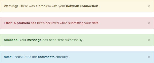
Alert boxes are used quite often to stand out the information that requires immediate attention of the end users such as warning, error or confirmation messages.
With Bootstrap you can easily create elegant alert messages box for various purposes. You can also add an optional close button to dismiss any alert.
Warning Alerts
You can create a simple Bootstrap warning alert message box by adding the contextual class .alert-warning to the .alert base class, like this:
<div class="alert alert-warning">
<a href="#" class="close" data-dismiss="alert">×</a>
<strong>Warning!</strong> There was a problem with your network connection.
</div>
— 上面示例的输出将如下所示:
Tip: If you want to enable the fading transition effect while closing the alert boxes, apply the classes .fade and .in to them along with the contextual class.
<div class="alert alert-warning fade in">
<a href="#" class="close" data-dismiss="alert">×</a>
<strong>Warning!</strong> There was a problem with your network connection.
</div>
Similarly you can create other variant of the alert messages, as follow:
Error or Danger Alerts
Add the class .alert-danger to the .alert base class to create error or danger alerts.
<div class="alert alert-danger fade in">
<a href="#" class="close" data-dismiss="alert">×</a>
<strong>Error!</strong> A problem has been occurred while submitting your data.
</div>
— 上面示例的输出将如下所示:
Success or Confirmation Alerts
Likewise, to create the success or confirmation alert message box add the contextual class .alert-success to the .alert base class.
<div class="alert alert-success fade in">
<a href="#" class="close" data-dismiss="alert">×</a>
<strong>Success!</strong> Your message has been sent successfully.
</div>
— 上面示例的输出将如下所示:
Information Alerts
For information alert messages add the class .alert-info to the .alert base class.
<div class="alert alert-info fade in">
<a href="#" class="close" data-dismiss="alert">×</a>
<strong>Note!</strong> Please read the comments carefully.
</div>
— 上面示例的输出将如下所示:
Links inside Alerts
Apply the utility class .alert-link to the links inside any alert boxes to quickly create matching colored links, as shown in the example below:
<div class="alert alert-warning fade in">
<a href="#" class="close" data-dismiss="alert">×</a>
<strong>Warning!</strong> There was a problem with your <a href="#" class="alert-link">network connection</a>.
</div><div class="alert alert-danger fade in">
<a href="#" class="close" data-dismiss="alert">×</a>
<strong>Error!</strong> A <a href="#" class="alert-link">problem</a> has been occurred while submitting your data.
</div><div class="alert alert-success fade in">
<a href="#" class="close" data-dismiss="alert">×</a>
<strong>Success!</strong> Your <a href="#" class="alert-link">message</a> has been sent successfully.
</div><div class="alert alert-info fade in">
<a href="#" class="close" data-dismiss="alert">×</a>
<strong>Note!</strong> Please read the <a href="#" class="alert-link">comments</a> carefully.
</div>
— 上面示例的输出将如下所示:
Closing Alerts via Data Attribute
Data attributes provides an easy way to add close functionality to the alert messages box. Just add the data-dismiss="alert" to the close button and it will automatically enable the dismissal of the containing alert message box.
<a href="#" class="close" data-dismiss="alert">×</a><br>
<button type="button" class="close" data-dismiss="alert">×</button>
<span class="close" data-dismiss="alert">×</span>
Closing Alerts via JavaScript
You may also enable the dismissal of an alert via JavaScript.
<script type="text/javascript">
$(document).ready(function(){
$(".close").click(function(){
$("#myAlert").alert();
});
});
</script>
Methods
These are the standard bootstrap's alerts methods:
$().alert()
This method wraps all alerts with close functionality.
<script type="text/javascript">
$(document).ready(function(){
$(".close").click(function(){
$(".alert").alert();
});
});
</script>
$().alert('close')
This method closes an alert message box.
<script type="text/javascript">
$(document).ready(function(){
$(".close").click(function(){
$("#myAlert").alert('close');
});
});
</script>
Events
Bootstrap's alert class includes few events for hooking into alert functionality.
| 事件 | 说明 |
|---|---|
| close.bs.alert | This event fires immediately when the close instance method is called. |
| closed.bs.alert | This event is fired when the alert message box has been closed. It will wait until the CSS transition process has been fully completed before getting fired. |
The following example displays an alert message to the user when fade out transition of an alert message box has been fully completed.
<script type="text/javascript">
$(document).ready(function(){
$("#myAlert").on('closed.bs.alert', function () {
alert("Alert message box has been closed.");
});
});
</script>


